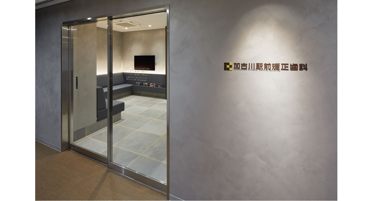
加古川駅前矯正歯科
以前から兵庫県加古川駅近くで歯科医院を経営されていたが、新たに矯正専門の歯科医院を開院したいとの要望だった。
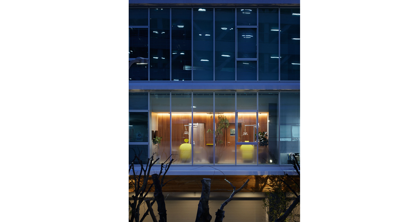
3階以上にビジネスホテルが入るテナントビルの2階で、北面の窓からは、街路樹の緑がよく見えた。
矯正専門の歯科で、ほとんどのお客は、歯が発達する前の小学生位の子とその親が多く、予約をして来院される。
通常の歯科医院と異なり、矯正の目的があって来院されるお客であるため、外観的にアピールするようなデザインではなく、
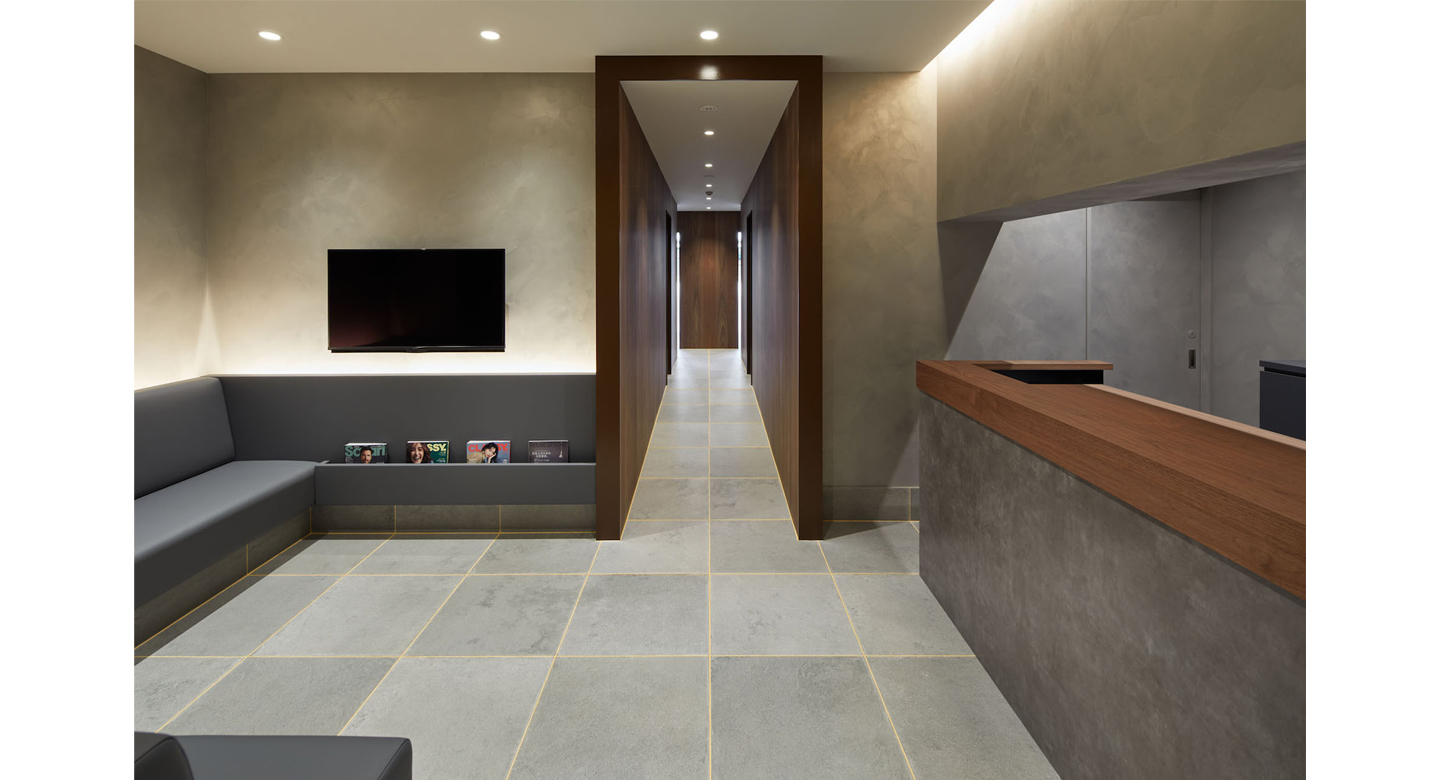
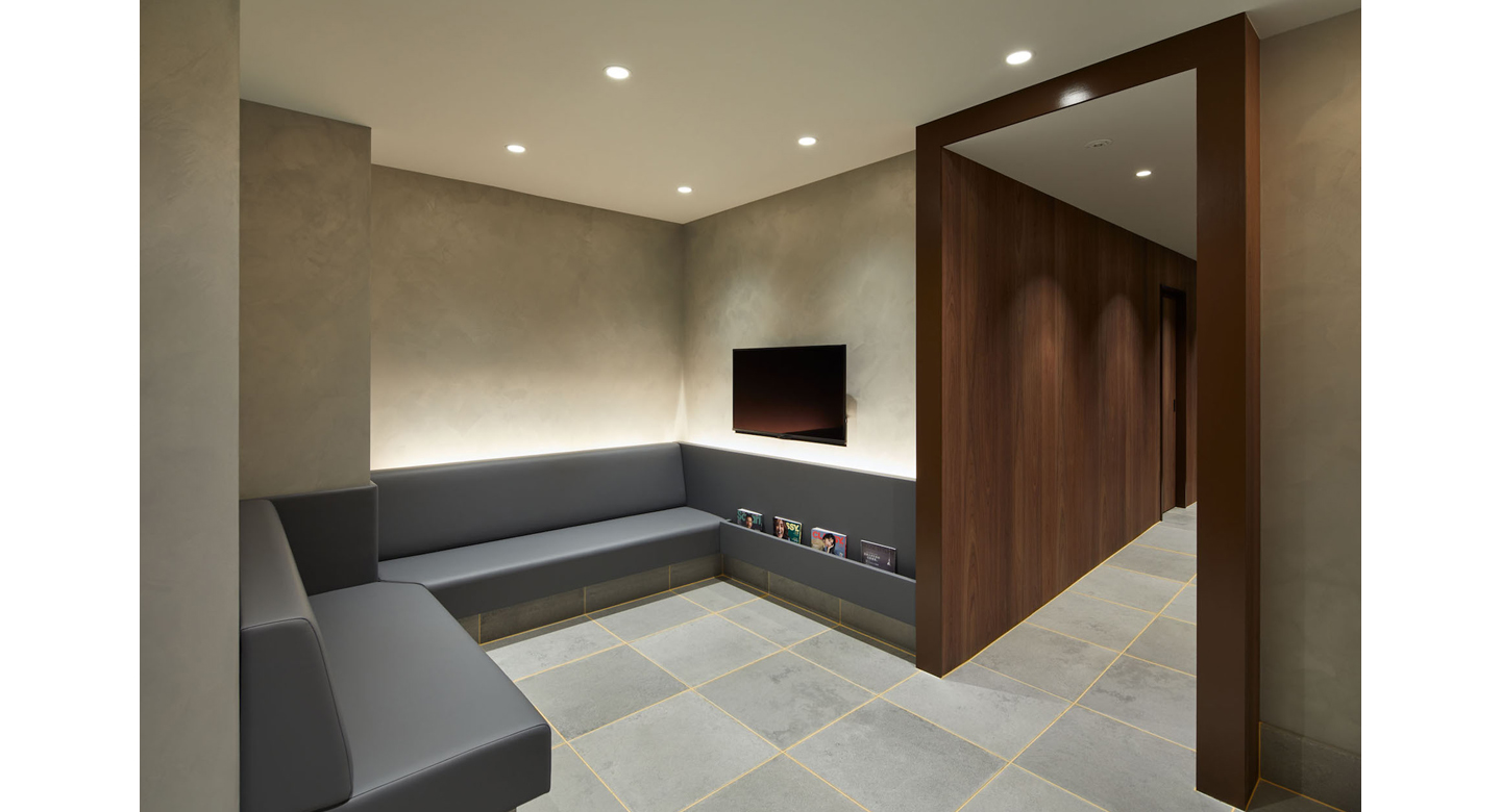
来院したお客が緊張せずに待合で待ち、通路を通って診察室に招かれ、診察室で快適に施術を受けられることが重要だと思った。
一般的な歯科医院のデザインは、清潔感からか、白色の天井、白色の壁、木目ビニルシートの床が多い。
不特定多数の客が対象の場合、そのような安心感や清潔感のあるデザインでも良いが、今回は特定の客であるため、もう少し特徴をだした、居心地の良いデザインができないかと考えた。
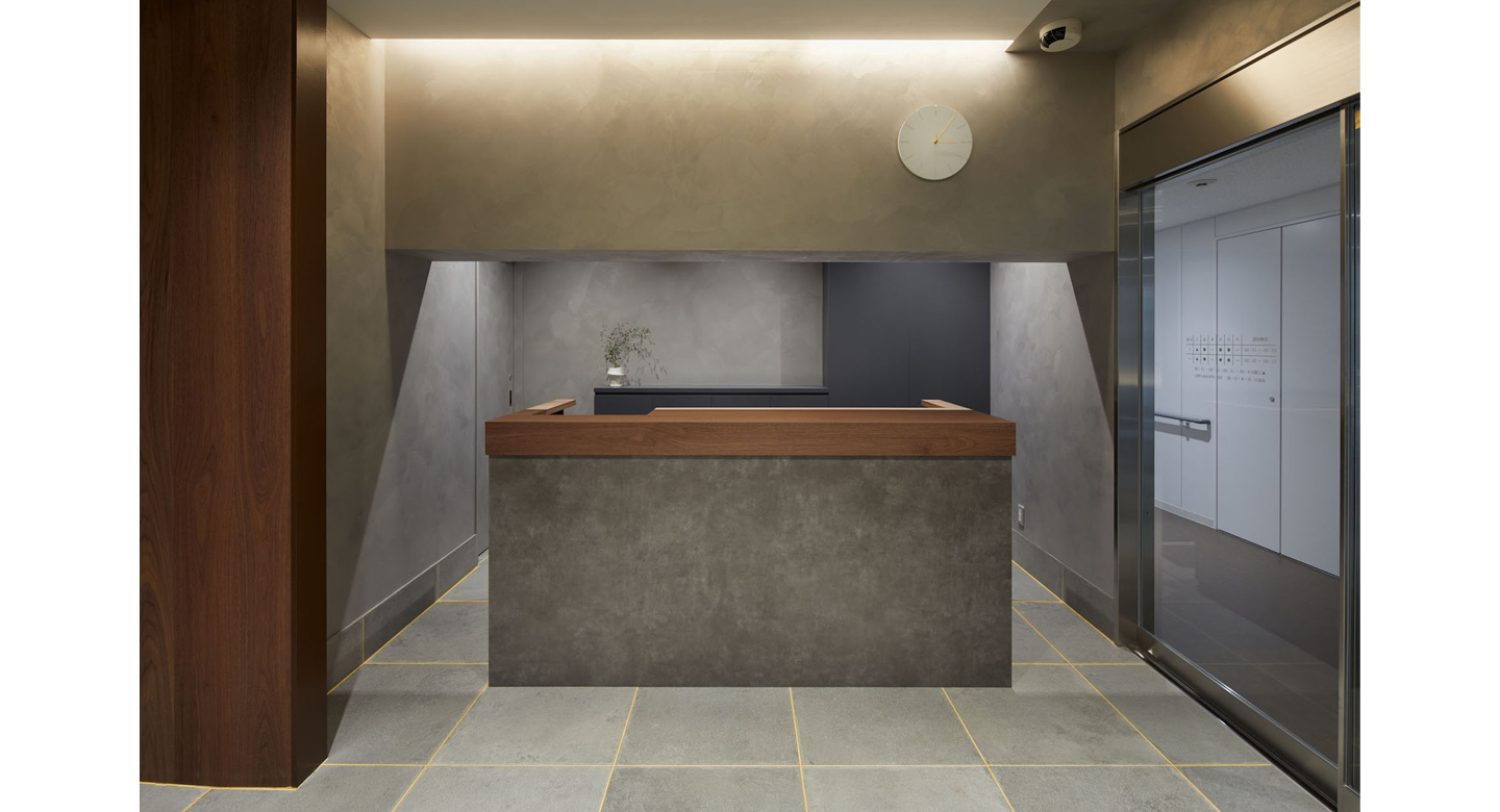
具体的には、全体的にグレー色の少しぼかした色を壁に塗り、受付や待合はホテルのような柔らかい雰囲気でデザインし、間接照明で包まれる空間とした。
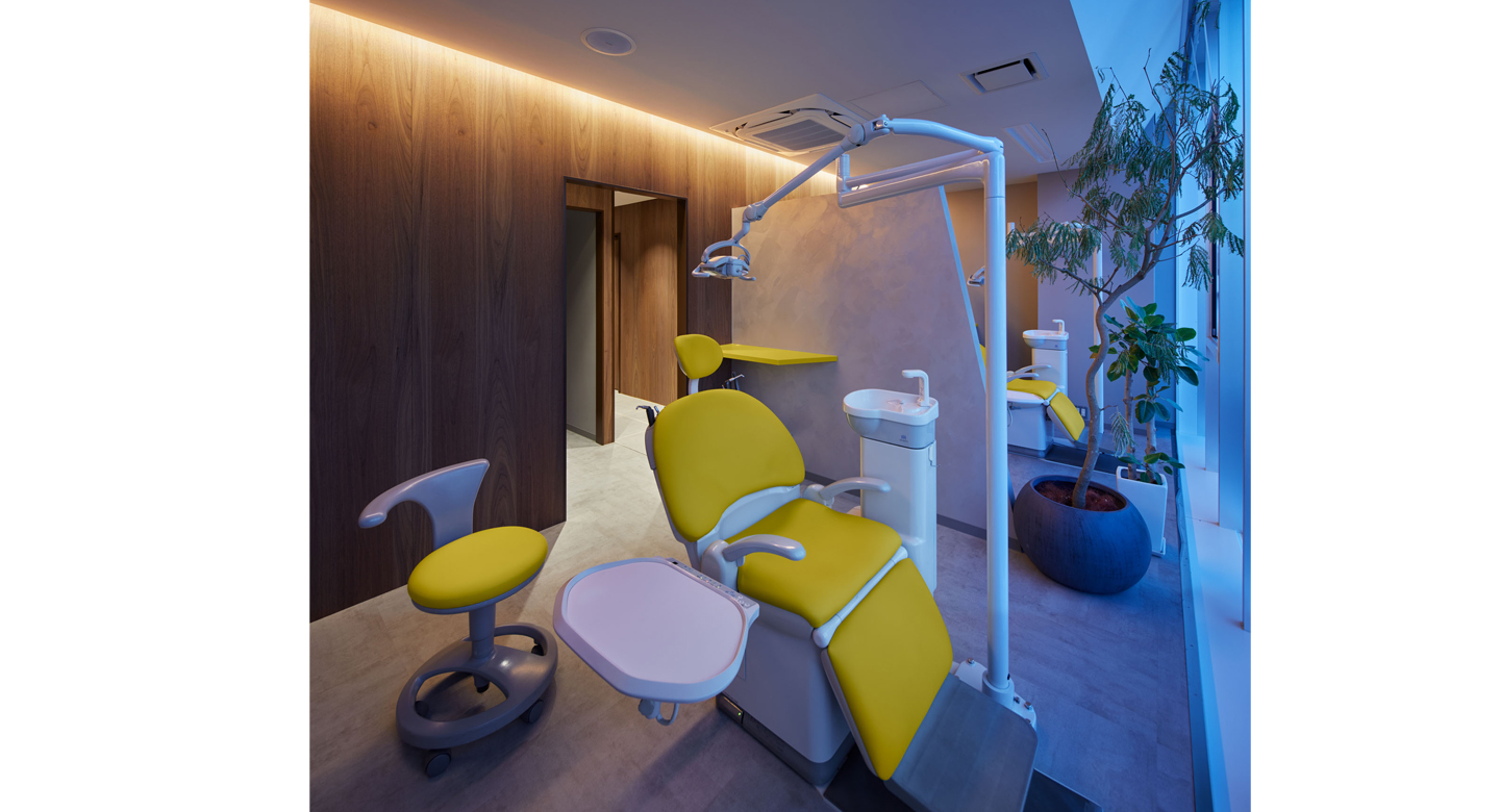
順番が呼ばれると、中央の木のトンネルのような通路を通ってから、診察室にアクセスできる構成。
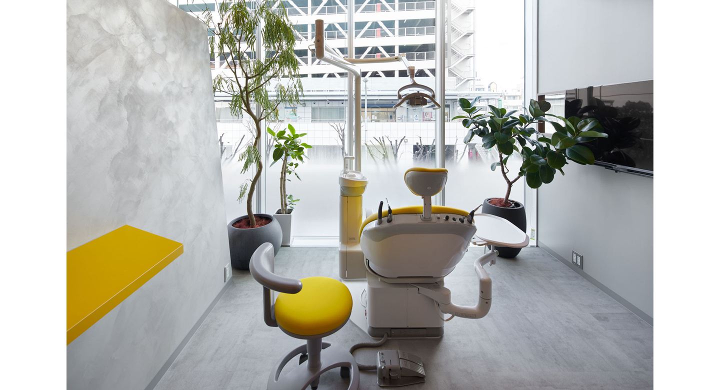
診察室は、ガラス越しに街路樹の緑がよく見えるように、ガラスの下側のみをグラデーションフィルムを貼り、背面壁は木貼りとし、間接照明で包まれるような空間とした。
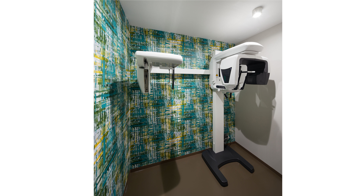
ロゴマークに使われた黄色を空間のアクセントカラーとし、床のタイル目地や、診察室の椅子、受付の時計の針に用い、X線室の壁紙も街路樹の緑をイメージした柄とした。
居心地の良いホテルライクな矯正歯科になったように思う。
Client had alredy been running a dental clinic near Kakogawa Station in Hyogo Prefecture for more than 10 years (the reception space had previously been refurbished), and he wanted to open a new dental clinic specializing in orthodontics.
The location is on the second floor of a tenant building with a business hotel on the third floor and above.
Since it is a dentistry specializing in orthodontics, customers make an appointment before coming to the clinic, and it seems that many of the customers are elementary school children and their parents
Because it is a limited number of customers who come to the clinic with a purpose than ordinary dental clinics,
Unlike general dental clinics, it is not designed to appeal to the appearance,
I thought it was important for patients who came to the hospital to wait in the reception space without getting nervous, be invited to the examination room through the aisle, and be able to receive treatment comfortably in the examination room.
I feel that most hospitals have white ceilings, white walls, and wood-grain vinyl sheet floors, probably because of their cleanliness. If the target is an unspecified number of customers, such a design that gives a sense of security and cleanliness is fine, but this time, since it is a limited number of customers, we thought that it would be possible to create a distinctive and comfortable design.
The yellow logo mark is used as an accent color, the tile joints on the floor are yellow, the chairs in the examination room are yellow, and the hands of the clock at the reception are yellow (laughs).
The entire wall was painted with a beige-gray color to give it a taste, and in some places, soft indirect lighting was applied.
The sofa in the reception area is a dark gray color, and it is devised so that magazines can be inserted into part of the sofa.
A dark beige gray tile is pasted on the waist of the reception counter to express a profound feeling.
The approach passage leading from the reception to the examination room has a wall made of walnut wood, and is designed to serve as a tunnel for changing moods.
The examination room is lit by light from the windows on the north side, and the greenery inside the room and the trees on the street become one, allowing you to receive treatment while looking at the greenery.
The walls of the X-ray room are covered with green patterned wallpaper to create a soothing effect.
photo:Nacasa&Partners